Graphic Design
From Mud to Fertile Fields
From Mud to Fertile Fields
Winning Logo Redesign for a Tractor Sales Company and its corporate apparel with modern style
Duration :
5 days
Location :
USA, Hondo
Project Source :
DesignCrowd Contest
Year :
2021
Winning Logo Redesign for a Tractor Sales Company and its corporate apparel with modern style
Duration :
5 days
Location :
USA, Hondo
Project Source :
DesignCrowd Contest
Year :
2021

The People Behind :
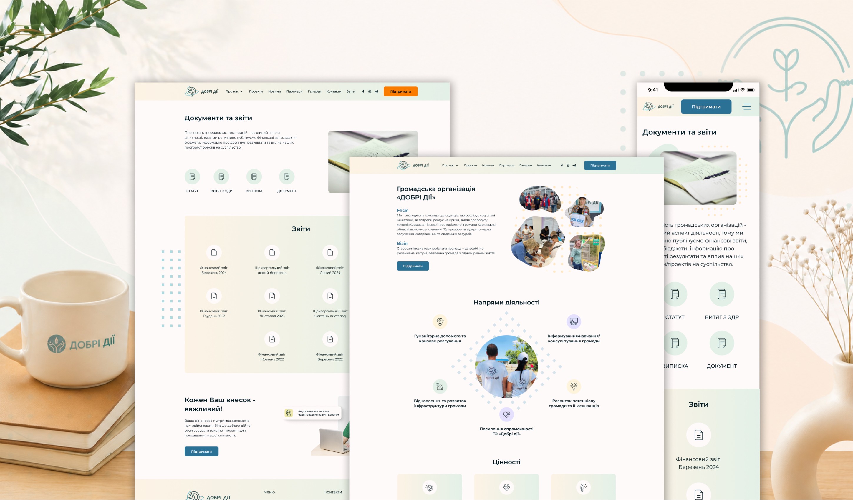
It is a Texas-based family enterprise with a 40-year history, growing from the sale of a single vintage tractor into a major regional Mahindra dealer. The company specializes in selling tractors, mowers, and parts worldwide, with a core focus on supporting small property owners and farmers.
Goal :
To redesign the company’s logo by incorporating a specific bucket attachment (reference provided below) and adding mud under the wheels as requested by the client. The primary goal was to transform the original imagery into a stylish, high-contrast graphic specifically optimized for high-quality printing on corporate apparel, such as T-shirts and caps.


results :
The final design features a powerful tractor with an integrated bucket, set against a backdrop of lush green grass instead of the initially requested mud. This strategic change symbolizes fertility, land productivity, and agricultural success, reinforcing the brand’s message of efficiency. The revamped logo delivered a fresh, modern look that translates perfectly onto various surfaces, creating a cohesive and professional brand image for the company’s merchandise.

More Projects


Graphic Design
From Mud to Fertile Fields
From Mud to Fertile Fields
Winning Logo Redesign for a Tractor Sales Company and its corporate apparel with modern style
Duration :
5 days
Location :
USA, Hondo
Project Source :
DesignCrowd Contest
Year :
2021
Winning Logo Redesign for a Tractor Sales Company and its corporate apparel with modern style
Duration :
5 days
Location :
USA, Hondo
Project Source :
DesignCrowd Contest
Year :
2021
The People Behind :
It is a Texas-based family enterprise with a 40-year history, growing from the sale of a single vintage tractor into a major regional Mahindra dealer. The company specializes in selling tractors, mowers, and parts worldwide, with a core focus on supporting small property owners and farmers.
Goal :
To redesign the company’s logo by incorporating a specific bucket attachment (reference provided below) and adding mud under the wheels as requested by the client. The primary goal was to transform the original imagery into a stylish, high-contrast graphic specifically optimized for high-quality printing on corporate apparel, such as T-shirts and caps.
results :
The final design features a powerful tractor with an integrated bucket, set against a backdrop of lush green grass instead of the initially requested mud. This strategic change symbolizes fertility, land productivity, and agricultural success, reinforcing the brand’s message of efficiency. The revamped logo delivered a fresh, modern look that translates perfectly onto various surfaces, creating a cohesive and professional brand image for the company’s merchandise.
More Projects
Graphic Design
From Mud to Fertile Fields
From Mud to Fertile Fields
Winning Logo Redesign for a Tractor Sales Company and its corporate apparel with modern style
Duration :
5 days
Location :
USA, Hondo
Project Source :
DesignCrowd Contest
Year :
2021
Winning Logo Redesign for a Tractor Sales Company and its corporate apparel with modern style
Duration :
5 days
Location :
USA, Hondo
Project Source :
DesignCrowd Contest
Year :
2021
The People Behind :
It is a Texas-based family enterprise with a 40-year history, growing from the sale of a single vintage tractor into a major regional Mahindra dealer. The company specializes in selling tractors, mowers, and parts worldwide, with a core focus on supporting small property owners and farmers.
Goal :
To redesign the company’s logo by incorporating a specific bucket attachment (reference provided below) and adding mud under the wheels as requested by the client. The primary goal was to transform the original imagery into a stylish, high-contrast graphic specifically optimized for high-quality printing on corporate apparel, such as T-shirts and caps.
results :
The final design features a powerful tractor with an integrated bucket, set against a backdrop of lush green grass instead of the initially requested mud. This strategic change symbolizes fertility, land productivity, and agricultural success, reinforcing the brand’s message of efficiency. The revamped logo delivered a fresh, modern look that translates perfectly onto various surfaces, creating a cohesive and professional brand image for the company’s merchandise.