UI / UX Design
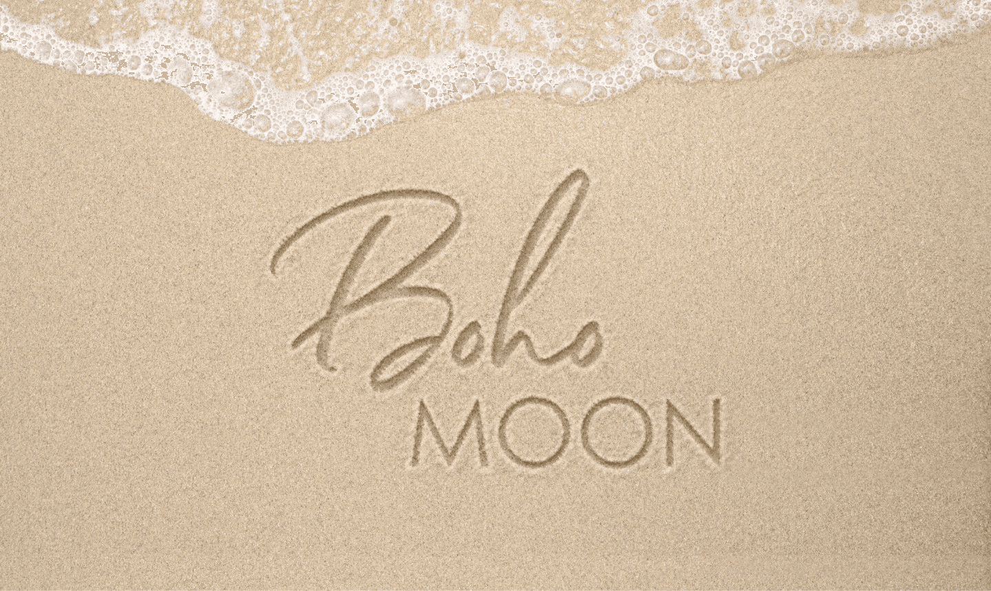
Logo Redesign
JIVI: From Stencil Art to Impact
JIVI: From Stencil Art to Impact
Logo redesign and UX/UI design for NGO JIVI, supporting addiction recovery and mental health for veterans and civilians.
Duration :
10 weeks
Location :
Ukraine, Kharkiv
Project Source :
IT Volunteers
Year :
2025
Logo redesign and UX/UI design for NGO JIVI, supporting addiction recovery and mental health for veterans and civilians.
Duration :
10 weeks
Location :
Ukraine, Kharkiv
Project Source :
IT Volunteers
Year :
2025

The People Behind :
NGO “JIVI” is a Ukrainian organization dedicated to supporting individuals who choose a sober lifestyle and promoting mental health across society. Through advocacy, education, and preventive initiatives, the organization raises awareness about addiction, codependency, and destructive relationship patterns, helping people build more conscious and fulfilling lives. The mission of the organization is to advocate for the rights and interests of people recovering from addiction, while contributing to the development of a healthier, more aware nation.
I invite you to Visit Site or explore the project on Behance… but shhh - between us, the Behance case is still a bit raw and not fully polished yet.
Goal :
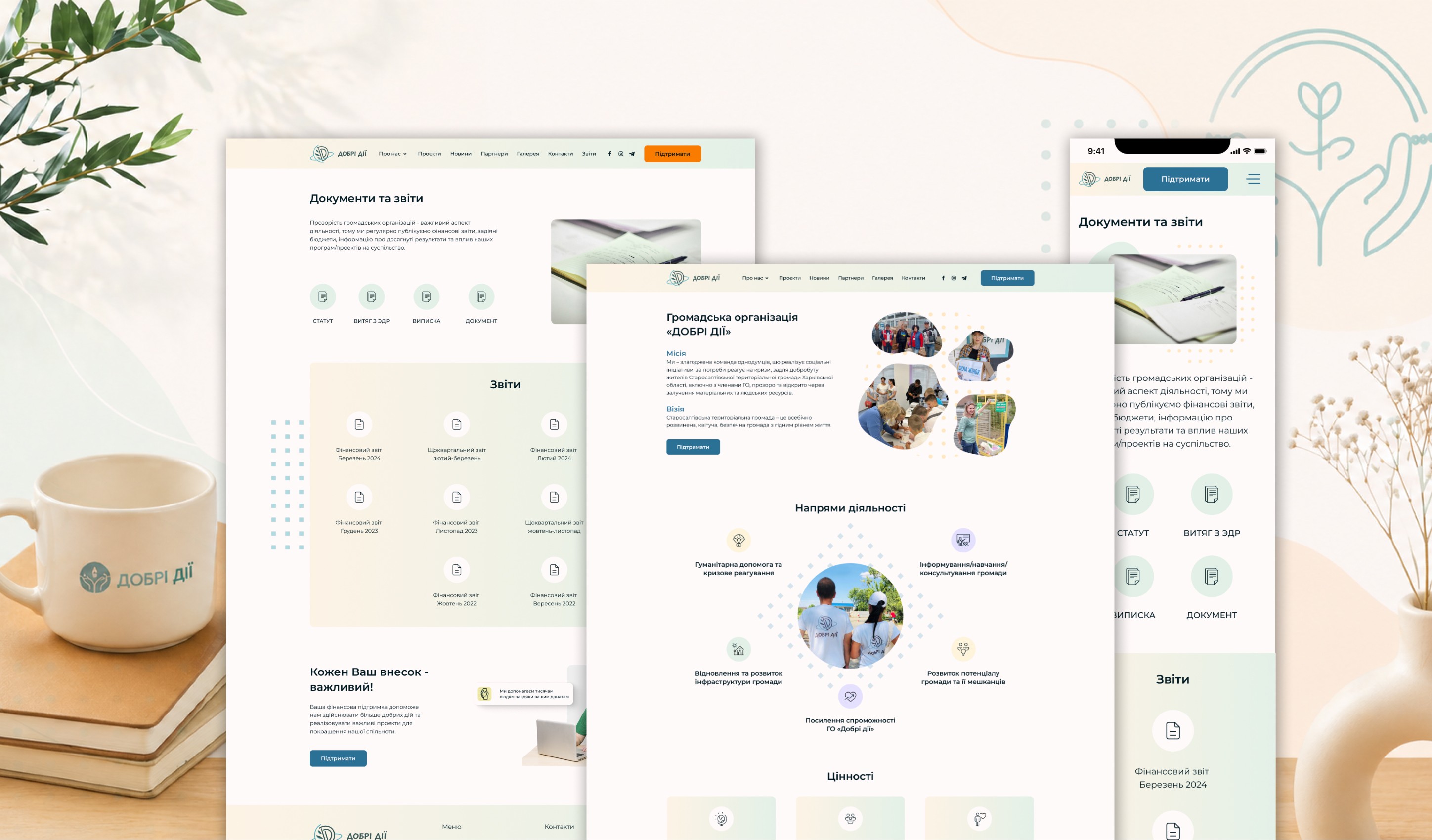
A key goal of the project was the creation of a dedicated website, as previously the organization relied mainly on a Viber link for communication. This significantly limited their reach, credibility, and ability to present their work in a structured way.
An important request from the organization was to preserve their existing visual identity - specifically the color palette and stencil-style typography used in their promotional materials.

Role :
The project was created from scratch and brought to life with the help of a team of IT volunteers.
As the Lead Designer, I managed the end-to-end transformation of JIVI’s digital presence. My challenge was to translate their "street-style" visual identity into a clean, professional web experience. Working with IT volunteers, I ensured that every element - from the refreshed logo to the wall-textured backgrounds - felt authentic and intuitive. The result was a design so aligned with the founder’s vision it felt like "mind-reading.
results :
The project resulted in a fully functional WordPress website, developed with the support of IT volunteers, ensuring flexibility and scalability for future growth.
The new site:
- Provides clear and accessible information about the organization’s mission and services;
- Strengthens trust and increases visibility among a broader audience serves as a central hub for communication, resources, and community engagement;
- Offers an intuitive and user-friendly experience for people of all ages.
The organization’s visual identity was carefully preserved, including its signature color palette and stencil-style typography. These elements, combined with wall-texture backgrounds, were seamlessly integrated into the design, creating a cohesive and recognizable visual language that authentically reflects the spirit of the organization.
After the design presentation, the organization’s leader, Dmytro, noted: “This is exactly what I had in mind.” While mind-reading isn’t involved, the design ultimately achieved its goal - to resonate perfectly with the project’s vision.
A refreshed, lighter version of the logo was also created as part of the redesign, giving the brand a more modern and approachable feel while staying true to its original identity.


More Projects


UI / UX Design
Logo Redesign
JIVI: From Stencil Art to Impact
JIVI: From Stencil Art to Impact
Logo redesign and UX/UI design for NGO JIVI, supporting addiction recovery and mental health for veterans and civilians.
Duration :
10 weeks
Location :
Ukraine, Kharkiv
Project Source :
IT Volunteers
Year :
2025
Logo redesign and UX/UI design for NGO JIVI, supporting addiction recovery and mental health for veterans and civilians.
Duration :
10 weeks
Location :
Ukraine, Kharkiv
Project Source :
IT Volunteers
Year :
2025
The People Behind :
NGO “JIVI” is a Ukrainian organization dedicated to supporting individuals who choose a sober lifestyle and promoting mental health across society. Through advocacy, education, and preventive initiatives, the organization raises awareness about addiction, codependency, and destructive relationship patterns, helping people build more conscious and fulfilling lives. The mission of the organization is to advocate for the rights and interests of people recovering from addiction, while contributing to the development of a healthier, more aware nation.
I invite you to Visit Site or explore the project on Behance… but shhh - between us, the Behance case is still a bit raw and not fully polished yet.
Goal :
A key goal of the project was the creation of a dedicated website, as previously the organization relied mainly on a Viber link for communication. This significantly limited their reach, credibility, and ability to present their work in a structured way.
An important request from the organization was to preserve their existing visual identity - specifically the color palette and stencil-style typography used in their promotional materials.
Role :
The project was created from scratch and brought to life with the help of a team of IT volunteers.
As the Lead Designer, I managed the end-to-end transformation of JIVI’s digital presence. My challenge was to translate their "street-style" visual identity into a clean, professional web experience. Working with IT volunteers, I ensured that every element - from the refreshed logo to the wall-textured backgrounds - felt authentic and intuitive. The result was a design so aligned with the founder’s vision it felt like "mind-reading.
results :
The project resulted in a fully functional WordPress website, developed with the support of IT volunteers, ensuring flexibility and scalability for future growth.
The new site:
- Provides clear and accessible information about the organization’s mission and services;
- Strengthens trust and increases visibility among a broader audience serves as a central hub for communication, resources, and community engagement;
- Offers an intuitive and user-friendly experience for people of all ages.
The organization’s visual identity was carefully preserved, including its signature color palette and stencil-style typography. These elements, combined with wall-texture backgrounds, were seamlessly integrated into the design, creating a cohesive and recognizable visual language that authentically reflects the spirit of the organization.
After the design presentation, the organization’s leader, Dmytro, noted: “This is exactly what I had in mind.” While mind-reading isn’t involved, the design ultimately achieved its goal - to resonate perfectly with the project’s vision.
A refreshed, lighter version of the logo was also created as part of the redesign, giving the brand a more modern and approachable feel while staying true to its original identity.
More Projects
UI / UX Design
Logo Redesign
JIVI: From Stencil Art to Impact
JIVI: From Stencil Art to Impact
Logo redesign and UX/UI design for NGO JIVI, supporting addiction recovery and mental health for veterans and civilians.
Duration :
10 weeks
Location :
Ukraine, Kharkiv
Project Source :
IT Volunteers
Year :
2025
Logo redesign and UX/UI design for NGO JIVI, supporting addiction recovery and mental health for veterans and civilians.
Duration :
10 weeks
Location :
Ukraine, Kharkiv
Project Source :
IT Volunteers
Year :
2025
The People Behind :
NGO “JIVI” is a Ukrainian organization dedicated to supporting individuals who choose a sober lifestyle and promoting mental health across society. Through advocacy, education, and preventive initiatives, the organization raises awareness about addiction, codependency, and destructive relationship patterns, helping people build more conscious and fulfilling lives. The mission of the organization is to advocate for the rights and interests of people recovering from addiction, while contributing to the development of a healthier, more aware nation.
I invite you to Visit Site or explore the project on Behance… but shhh - between us, the Behance case is still a bit raw and not fully polished yet.
Goal :
A key goal of the project was the creation of a dedicated website, as previously the organization relied mainly on a Viber link for communication. This significantly limited their reach, credibility, and ability to present their work in a structured way.
An important request from the organization was to preserve their existing visual identity - specifically the color palette and stencil-style typography used in their promotional materials.
Role :
The project was created from scratch and brought to life with the help of a team of IT volunteers.
As the Lead Designer, I managed the end-to-end transformation of JIVI’s digital presence. My challenge was to translate their "street-style" visual identity into a clean, professional web experience. Working with IT volunteers, I ensured that every element - from the refreshed logo to the wall-textured backgrounds - felt authentic and intuitive. The result was a design so aligned with the founder’s vision it felt like "mind-reading.
results :
The project resulted in a fully functional WordPress website, developed with the support of IT volunteers, ensuring flexibility and scalability for future growth.
The new site:
- Provides clear and accessible information about the organization’s mission and services;
- Strengthens trust and increases visibility among a broader audience serves as a central hub for communication, resources, and community engagement;
- Offers an intuitive and user-friendly experience for people of all ages.
The organization’s visual identity was carefully preserved, including its signature color palette and stencil-style typography. These elements, combined with wall-texture backgrounds, were seamlessly integrated into the design, creating a cohesive and recognizable visual language that authentically reflects the spirit of the organization.
After the design presentation, the organization’s leader, Dmytro, noted: “This is exactly what I had in mind.” While mind-reading isn’t involved, the design ultimately achieved its goal - to resonate perfectly with the project’s vision.
A refreshed, lighter version of the logo was also created as part of the redesign, giving the brand a more modern and approachable feel while staying true to its original identity.